Movie Multiview
This is a duo project developed with my partner Yi Li for the class "CS 4460 - Intro to Information Visualization" at Georgia Tech. Our assignment instructions were to develop a web visualization with the D3.js library from a list of selected CSV files. We opted to use the movie CSV file and transform it from data in an excel table to a full blown out single-page multiview graph that's built with info vis features such as Pie/Bar Charts, Details on Demand, and Brushing & Linking funcitonality. Additionally, we utilized an API that provided us with movie poster images. The project achieved a high A in the class, and I went on to actually become a Graduate Teaching Assistant for Professor Alex Endert who teaches the course.
- Client:Georgia Tech Class Project
- Website:Github Repo
- Completed:December 4th, 2018
Background
Information visualization goes beyond presenting information as static charts, graphs and maps by leveraging the power of computer interaction to help people analyze, understand and make decisions from data.
Dozens of companies – including Google, Microsoft, IBM, Oracle and SAP – offer Information Visualization tools. Thousands of companies and governments use the tools for daily operations and for longer-term strategic planning.
D3.js is a JavaScript library for manipulating documents based on data. D3 helps you bring data to life using HTML, SVG, and CSS. D3’s emphasis on web standards gives you the full capabilities of modern browsers without tying
yourself to a proprietary framework, combining powerful visualization components and a data-driven approach to DOM manipulation.
Goal
This final programming assignment of the term is a more open-ended data visualization challenge. The assignment had provided five potential datasets for you to visualize. It is our job to select one, then design and implement an interactive visualization of the data. We had to implement our visualization for the web, using D3 and Javascript. Where applicable, we had to leverage the visualization design paradigms and techiques that we have learned about this term (e.g., overview and detail, dynamic queries, brushing and linking, various visualization techniques, etc.) In terms of complexity, fidelity, and depth, they’re are looking for interactivity, potentially multiple views, and an overall design that adheres to principles that we’ve covered in this course.
Process
When looking through all the CSV data sets provided to us, we noticed that we had to deal
with over 1000+ data cases. We found the movie data set to have some interesting attributes
and proceeded in designing a multiview graph. Our goal was to create multiple, linked
visualizations that included interactivity and coordinated views. The first challenge we faced was
we had to decide on which attributes to use and how to clean the “movies.csv”. We noticed
many attributes had blank spaces, and the movie_title column had weird characters. So we
decided to clean the data set by inserting a “0” for any blank spaces and got rid of all those
weird characters, and then copied over clean columns in a new csv file.
Next, we had to decide what types of visualizations in order to represent our selected
attributes. We thought using a dual-linked scatterplot with brushing and linking
capabilities with other charts would be an awesome extension. Additionally, due to the amount
of data cases we had to include, we thought it’d be the best way to be able to click on a single
data point. After many scatterplot views, we decided that having a Number of Critic Reviews
and User Reviews vs IMDb score would be the best viewing distribution. Finally, for ordinal
attributes such as the year, we decided to go with a bar chart. For nominal attributes such
country and language, we went with a pie chart.
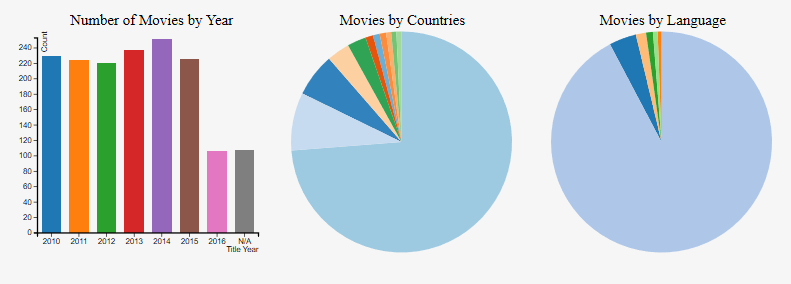
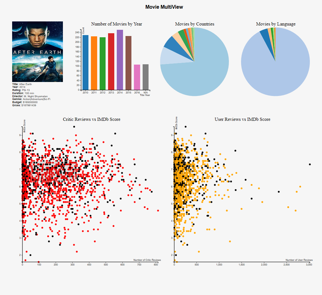
The "Number of Movies by Year" chart is an
interactable bar chart in the visualization. It
shows how many movies were published
during each year. If a movie doesn’t have a
specific title year, it will be counted into N/A
category. When you move the mouse over the
bar, the bar will turn into a silver-gray color and
the data will be shown on the top right corner of
the graph. When you move your mouse away
from the bars, the information will disappear
and the color will be back to its original color.
When you click on a bar of a certain year, the
two scatterplots will highlight the movies that
were published during that year.
The "Movies by Countries" chart is an interactable
pie chart in the visualization. It shows how many
movies were produced in different countries. The
other category holds the movies was produced by
a country that has less than ten movies listed in
the dataset. When you move the mouse over the
bar, the bar will turn into a silver-gray color and
the data will be shown in the center of the pie
chart. When you move your mouse away from the
bars, the information will disappear and the color
will be back to its original color. When you click
on a certain country, the two scatterplots will
highlight the movies that were produced by the
country. This is similar behavior for the "Movies by Languages" chart.
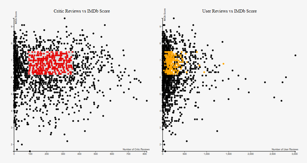
The "Critic Reviews vs IMDb Score" and "User Reviews vs IMDB Score" are both interactable scatterplots in the visualization. It shows the relationship between critic reviews and the IMDb score. When you double-click a certain data point at the graph, the current data point and data point corresponded to the current data point in the other scatter plot will be highlighted, and the information chart will display the details of the movie. There is also "Brushing and Linking" technique implemented. When you highlight a certain region of the scatterplot, the data points in the other scatterplot, which correspond to the data points that are currently highlighted will also be highlighted. When you move the highlighted region, the highlighted points in the other scatterplot will also be shifted to the current points. When you single click on the graph, the brush will clear.
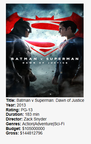
Finally, this is the "Details on Demand" information chart for the visualization. When you double-click a data point in either of the two scatterplots, the detail information of the movie will be shown in this chart. The information includes the tile, year, rating, duration, director, genres, budget and gross. If any of the information is not available in the original dataset, it will be classified as unknown. Additionally, with the help of a Movie API script, we were able to give it our movie title and output the main movie poster if the user is connected to the internet! This was a visual detail I thought would add a nice finishing touch to the multiview graph.
Results
This is the final result when all components were nicely put together. It fully combined all the previous project assignments we had done in the class and faithfully applied all the concepts we had learned. We provided a list of analysis tasks that we accomplished:
- Retrieve Value - when double clicking a point on the scatterplot, retrieve values for movie attributes of: title, year, rating, duration, director, genres, budget, and gross if provided
- Filter - given concrete conditions of year, country, or language, a user is able to hover over and click on a bar on the barchart or slice on pie chart, and then have those movies that match that filter highlighted on the two linked scatterplots below
- Compute Derived Value - when hovering over a bar on bar chart or a slice on pie chart, compute value for total count of movies in that category and have it show up on graph.
- Sort - for the bar chart we have sorted all the data cases according to the year they were released, with an extra ‘N/A’ section for movies with an unknown release year. For the countries and language pie charts, we sorted the movies based on their each respective attribute and made separate slices, with a ‘Other’ category for movies which there aren’t over 10 movies from that country, or over 5 movies in that language respectively.
- Determine Range - given all the movie cases, we found the range of movies from a near 0 IMDb score to a perfect 10 IMDb score.
- Find Anomalies - on the scatterplot you can visually see the outliers that are spread further apart from other data points, with some points being at extreme ranges on both ends of the X and Y axis spectrums.
- Cluster - on the scatterplot you can visually see clusters of movies with a similar rating and number of critic reviews/user reviews. A user can brush over an area and view a similar cluster on the other linked scatterplot.
- Correlate - the biggest thing with our multiview graph is that all graphs are correlated with each other! If a user clicks on a bar in the year chart, all movies released that year will be highlighted on both scatterplots. Similarly, if a user clicks on a country or language slice on our pie charts, those respective movies will also be highlighted. This can be extremely useful for analysis questions.
Summary
This was a very useful and interesting course for me that taught me an introduction to information visualization using the D3.js library. As one of my first classes into web programming, it drew me to further explore the field. I would eventually go on to actually become a future Graudate Teaching Assistant to Professor Alex Endert who teaches this course when I became a graduate students pursuing my Masters in Computer Science with concentration in Human Computer Interaction. I was responsible for then grading and teaching 120+ students every semester the same material I had learned when I was in their shoes. It was a very good experience both as a student and a teaching assistant. The skills I learned greatly helped me for a future internship with Nike when I got asked by an engineering manager if I could graph data provided from an excel table. I was able to reference this project from my course and the concepts I had learned to be of use in a real-world situation! You can view the Github repo where this project is hosted at the top of this page!