Profile Boards
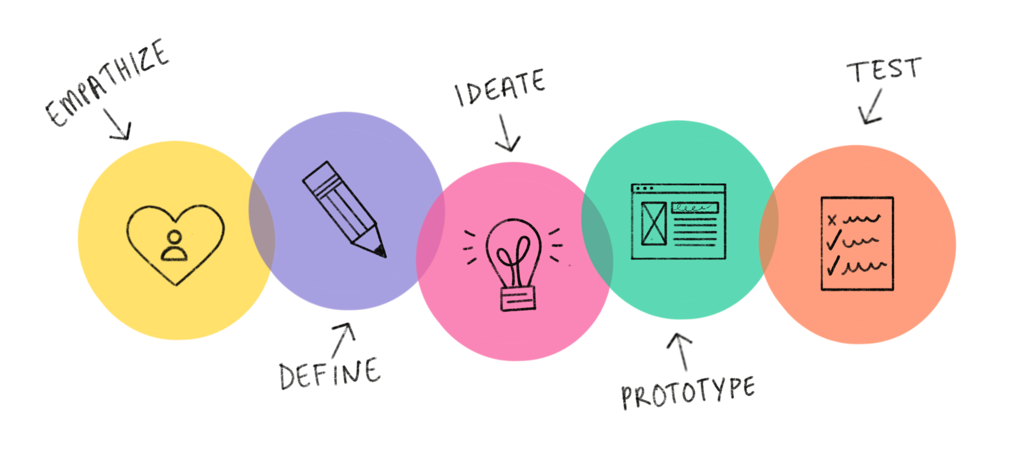
Spring 2020 graduate group project for CS 6750 Human-Computer Interaction class at GT. Our group focused on rock climbing, specifically indoor rock climbing on traditional flat walls and bouldering variants, as our primary problem domain. We are basing our research on indoor climbing gyms that have an integrated LED climbing walls. We have gone through the entire design thinking process of empathizing and conducting interviews with rock climbers, defined and ideated up to 100 prototype ideas through SCAMPER and brainstorming sessions, built out lo-fi and high-fi protoypes, and have tested our final protoype with cognitive walkthrough sessions conducted online with classmates.
- Client:GT Graduate Class Prototype
- Prototype:Profile Boards
- Paper:Graduate Paper
- Completed:May 1, 2020
Background
Rock climbing as a sport has steadily increased in the number of facilities over the past decade. The proliferation of indoor climbing gyms has increased the accessibility, and thus the popularity, of the sport of climbing in the United States. Since this variant is not outdoors, environmental conditions ranging from rock construction to proper equipment usage can be controlled more in an indoor setting. Because of this recent traction in membership, it presents an interesting new sports-related problem domain in terms of HCI work. Specifically, we can foresee the uses of many technologies in this field including, not limited to: mobile devices, fitness tracking, context-aware ubiquitous technologies, augmented/virtual reality, and many more. With our initial research and gathering of user feedback, we have determined that there is a desire to improve the current condition of indoor rock climbing gyms. In this project, we employed user research methods, such as semi-structured interviews and online research on the current state of climbing technologies, applied analysis of user research through affinity diagramming, presented our findings of design implications, and designed lo-fi prototypes based on the top three ideas on the future of indoor rock climbing technology. We have narrowed it down to the top three prototype ideas and picked the best one to iterate three high fidelity designs. We've also tested it with cognitive walkthroughs with our classmates.
Goal
We have defined three major design criteria about people's motivations, desires, concerns, frustrations, etc. on their current thoughts about modern day indoor climbing:
- Trackability: The technology solution should be able to track, log, notify, or save rock climbing routes of the past, present and future for some sort of personal provenance inside and outside of the gym.
- Learnability: The technology solution should be able to teach the basics of climbing, proper technique, correct posture or provide training sessions for beginner climbers, advanced climbers and trainers who use it for instruction.
- Personalization: The technology solution should provide the ability for greater customization of routes or training sessions on a rock wall according to each individual’s skill set or climbing preferences.
- Trackability: Success would be defined as how convenient a solution would be that allows the user to successfully track or save a particular route of interest. This ability could range from allowing users access to see past and current route information, getting notified of when new routes are available in the gym, warning users when certain routes will be rotated out, or save completed/wishlist/personalized routes. Failure would be defined as having a very inconvenient way for members to access personal provenance, having no or restricted access to view route information, failure to notify climbers of route changes in some visible/audible form, or sudden deletion or obstruction of saved climbing lists due to errors or data loss.
- Learnability: Success would be defined as how easy it is for climbers to successfully learn a given route or training session. This could be some form of visible or audible tutorial that instructs rock climbers how to climb particular routes, beginner climbing basics, or correct posture and form. The instructive format should be as clear and concise as possible such that the climber can understand with ease. Failure would be defined as being really difficult for a climber to understand how to climb or train on a particular route. This could be that the instruction is difficult to comprehend, too short or too long in length (any format), or is inconvenient or disruptive in a climbing gym environment.
- Personalization: Success would be defined as allowing some method for a climber to set a customized climbing route or training session according to the individual’s preferences. This could be some ability that modifies the gym environment in some shape or form or design customized solutions for climbers. Failure would be described as the inability to set personalized preferences in some form, inconvenience or disruptive use of the technology at hand, or lack of customization options that are not entered in by the user.
User Research Process
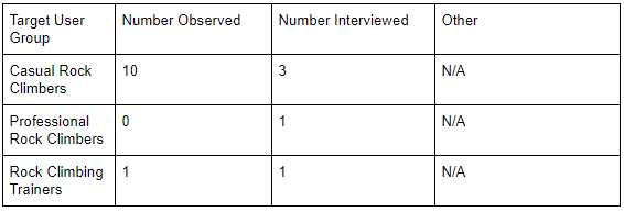
The research methods used to gather information and provide the basis for our future decisions primarily consisted of interviews from different stakeholders of the subject. When considering methods that would prove to be the best way to determine a course of action, we decided that going straight to the source would provide the most useful information to us. As such, we decided to interview representatives from 3 distinct groups of stakeholders. We managed to obtain permission from members that fell in each group by reaching out to local facilities such as the Georgia Tech CRC and local rock climbing communities for volunteers.
The interviews allowed us to get a variety of perspectives of the current and aspired future of rock climbing directly from actual rock climbing participants. However, we also decided to supplement this with additional online research, looking into what technologies already existed and if the interview responses corroborated the findings. This led to finding mobile apps that helped climbers find outdoor climbing routes and plan climbing workouts. In addition, this led to finding an LED hold system that allows for more flexible route creation and potential for more training possibilities, as a rising innovation.
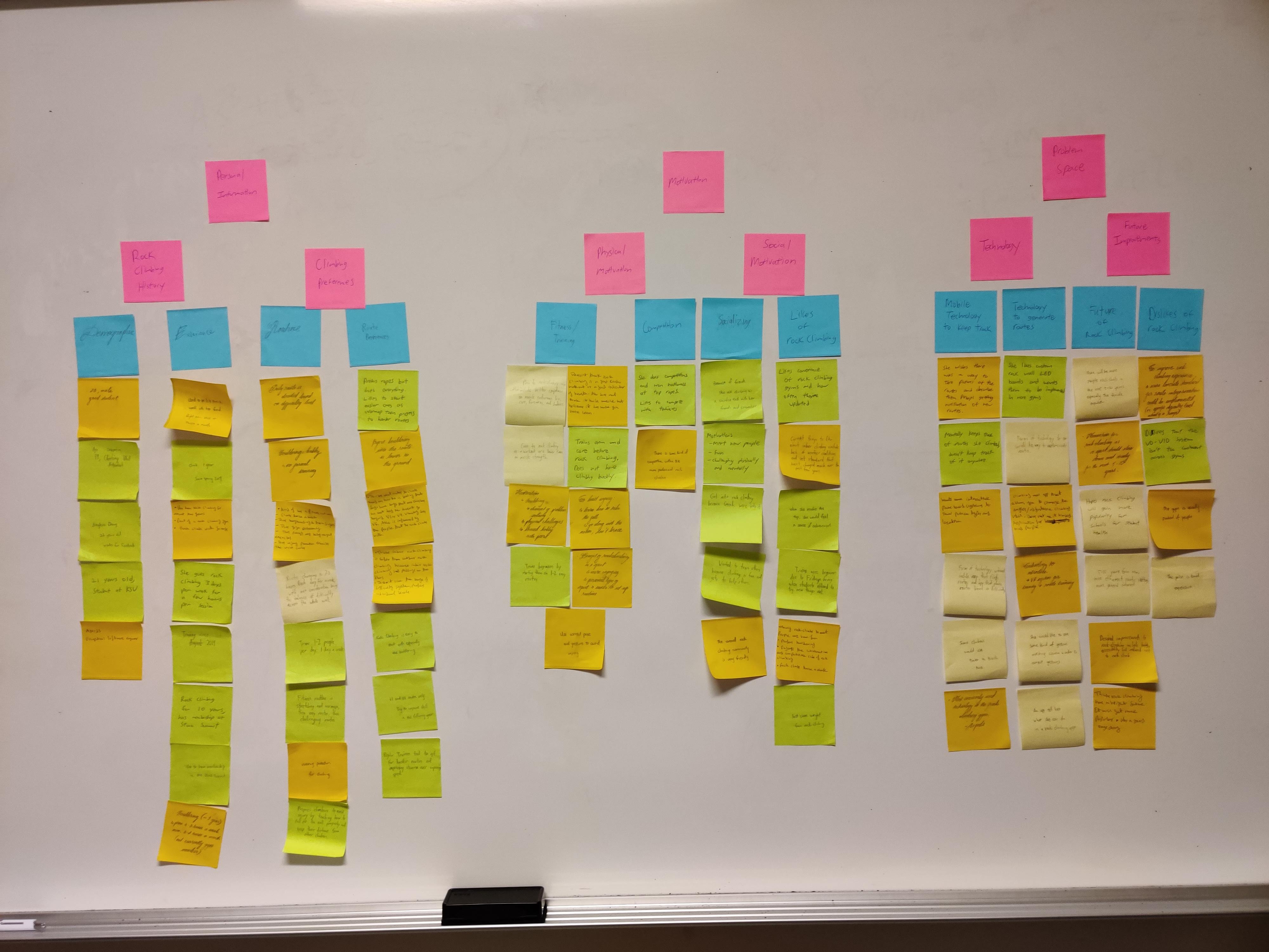
For data analysis, our team chose to create an affinity diagram.
Each team member was responsible for going through the interview conducted by themselves.
As we go through the interviews, we tried to find the interesting ideas and main points from our participants and used them to create sticky notes.
In a bottom-up fashion, we created an affinity diagram as a team with the affinity notes (See picture above). We used the yellow notes as our base notes to generate blue note columns
by grouping of similar themes. Then using the blue notes, we created two levels of pink notes (due to lack of another color). From those pink notes, we are able to identify our primary
problem spaces from our interviews. We were then able to define our design criteria from this affinity diagram as shown in our goals section.
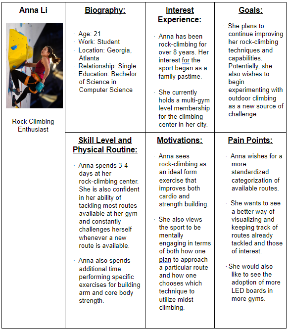
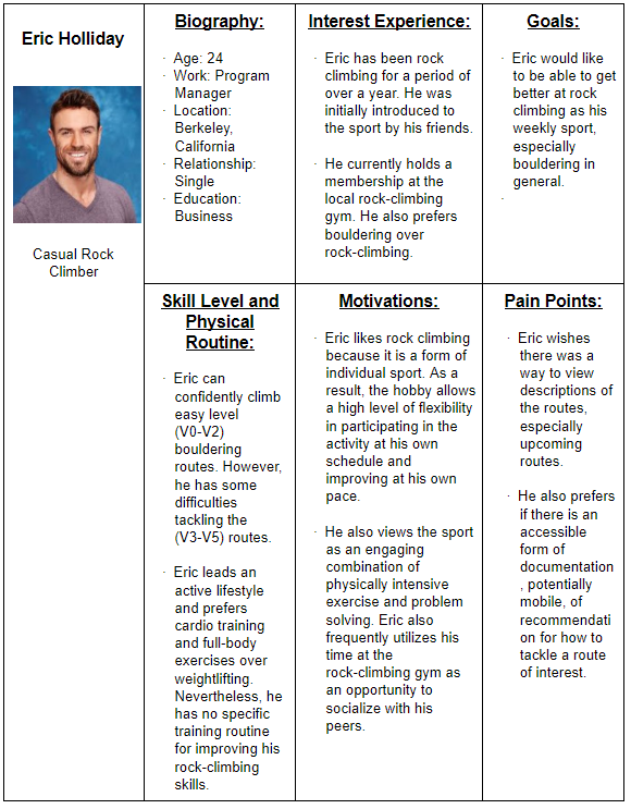
We were then tasked to create user personas representing our main target audience. Our group decided to create
two different personas, one for a professional rock climber, and one for an amataur rock climber:
Ideation
First method used for ideation was an open brainstorming session. We wrote our three main design criterias on a white board. We had one person type on a Google Document
while the other four members pitched ideas that met at least one design criteria. We wrote down each unique idea pitched that seemed somewhat feasible, meaning it seemed realistic
or potentially possible, while also encouraging out of the box ideas. At times, group members rejected ideas that did not entirely meet a design criteria, was deemed impossible with current technology,
or was deemed too dangerous for climbers. We came up with a total of 52 ideas in BLACK text.
We met for second ideation method which was SCAMPER done on the same Google Document. Due to the nature of the method, we thought it was appropriate for each member to do around 10 SCAMPERs modifying
one variable from an original idea from our brainstorming session in the previous meeting. We positioned it so that the SCAMPER ideas were done in RED text right under the brainstormed idea done in BLACK text.
It was more readable this way and allowed us to see which SCAMPER method was used and which idea it was derived from. Since we were all together in the same room and using a Google Document, we were able to talk
in real time to explain each of our ideas such that we didn’t overlap. We came up with 48 ideas, which combined with the brainstormed ideas to amount to 100 total.
- Augmented/virtual reality systems
- Physical touch screen integration in gyms
- Web applications for tracking/learning
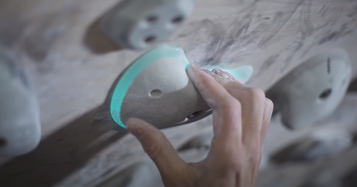
- LED/smart rock boards in the environment
- Machine learning/camera tracking of routes
- Mobile technologies for ubiquitous tracking/learning
- Smartwatch/bluetooth sensor connectivity
- Other technology
Prototyping
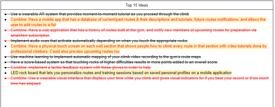
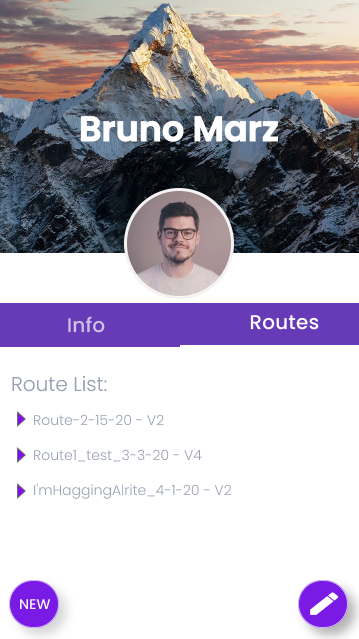
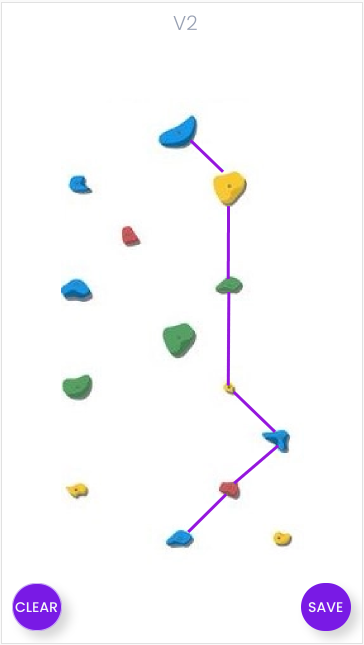
With our top three ideas, our next milestone was to create low fidelity prototypes for each idea, and then select the best one as a group to create a high fidelity prototype with. We liked the concept of Profile Boards: Mapping of planned routes with LED rock lights. It was derived from one of our original 100 ideas that stated “LED rock board that lets you personalize routes and training sessions based on saved personal profiles on a mobile application”. Here are the screens of the low fidelity prototype below with a sketch of our concept idea:
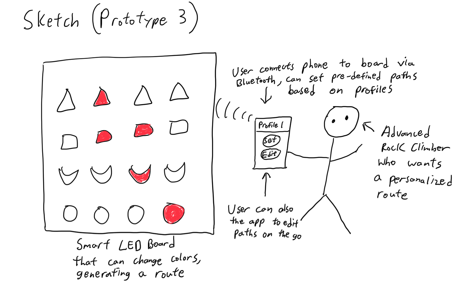
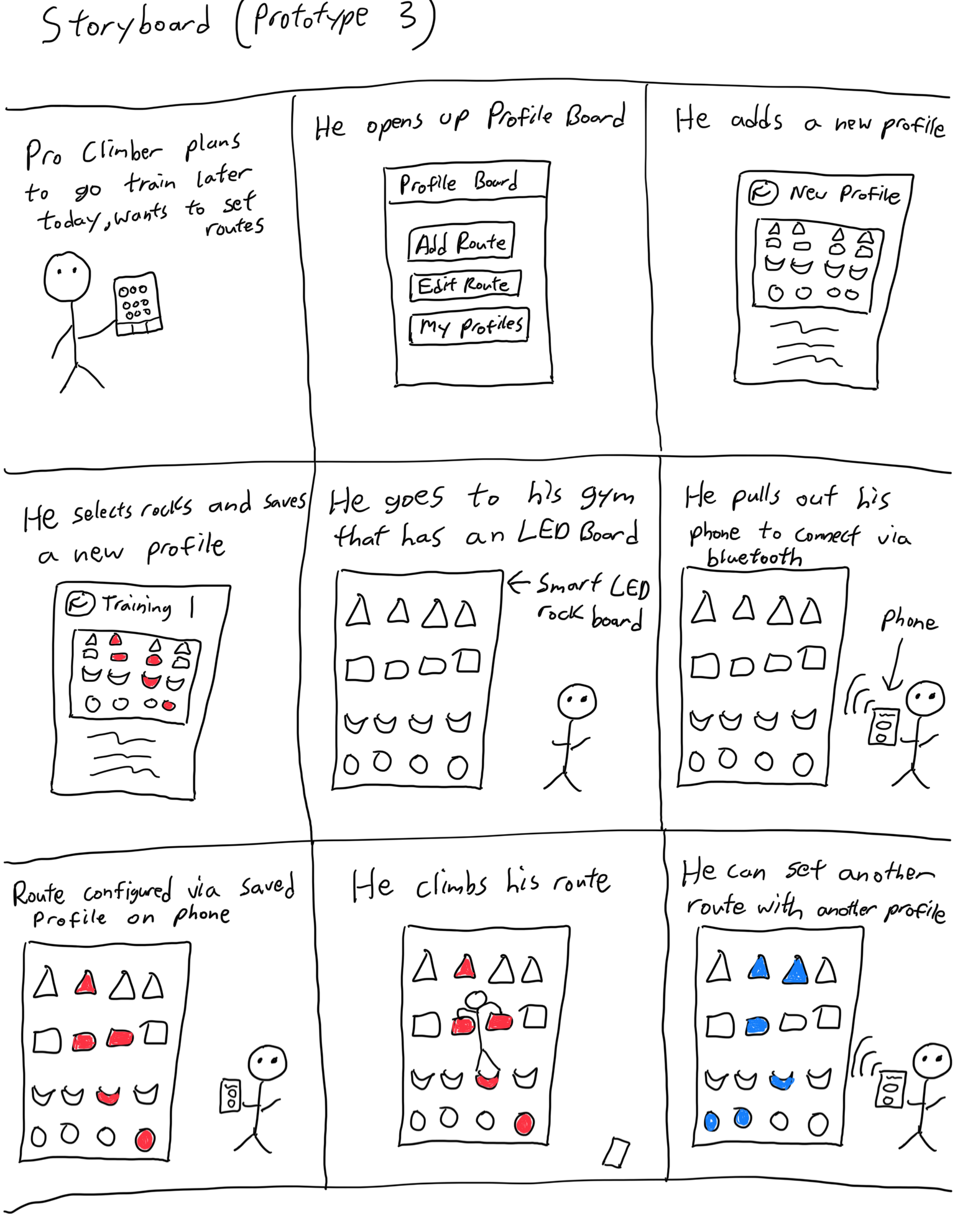
We had three primary key activities for our Profile Board Concept based on our design criteria:
- Designing Routes: The prototype should be able to let the user customize and design rock climbing routes based on the same color. The interface should show the user a blank rock wall and allow the user to select certain rocks as they create their own path on their mobile application. This implies that there is a smart or LED rock wall in place at the gym. This meets the personalization design criteria as influenced by our interviews with an advanced rock climber and the GT rock wall trainer who both stated a greater desire for more integration with advanced rock climbing technology. Important stakeholders would be beginner or advanced rock climbers that would be consumers utilizing this feature, trainers that could design custom training routines for their clients, and gym staff who could automatically generate new routes instead of manually replacing rocks.
- Saving & Loading Profiles: The prototype should be able to allow users to save personalized routes into a profile on the mobile application. When the user arrives at the gym, there should be smart connectivity such as wifi, bluetooth, or NFC communication that allows the user to connect to the smart LED rock wall. Then, the user is able to select and load a profile onto the wall such that the appropriate LED lights light up the set color and displays the customized route path while turning off rocks that aren’t part of the path. Users should be able to revisit, revise, or delete profiles at will. This meets the trackability design criteria as influenced by many of our Stone Summit member interviews where they believe some sort of tracking or saving feature would be beneficial for personal climbing provenance. Important stakeholders include beginner, advanced, and trainers who would be the consumers that create accounts to design and save profiles to be loaded onto the rock wall, as well as the gym staff or technology consulting companies that manage the rock wall technology.
- Training Sessions: The prototype should allow users to create custom tailored training sessions such as the design of the route, the progression of difficulty, the amount of repetitions, the time it takes to complete each route, etc. These training sessions would primarily be repetitions or timed exercises. This meets both personalization and learnability design criteria, and it was influenced by our interview with a gym trainer at the GT rock wall who stated having more personalized training sessions are important for the growth of bouldering skills. The important stakeholders in this case would primarily be advanced rock climbers and trainers who would develop personalized training routines for their clients to learn and gain physical experience with.
Testing
For this portion of our project’s conception, we decided to design an interactive prototype that would promote our chosen idea of personalizing climbing routes for users. Due to the dynamic exchange between user’s
actions and prototype’s feedback, a cognitive walkthrough should be the obvious evaluation technique implemented for the analysis of the prototype. This is due to the fact that it would allow the users to assess how
the application assists them in the process of accomplishing individual tasks with the intention of achieving a higher level goal.
Overall, the ultimate goal of the application is to create a seamless process that would allow users to effectively create a personal climbing route and project such a route onto the climbing wall of their chosen gym.
As a result, the cognitive walkthrough contains specific tasks that the users should accomplish when interacting with the prototype in order to achieve the above-mentioned goal. At the same time, these tasks can be further
broken down into even smaller activities that provide opportunities to closely track user-prototype interactions and simultaneously allow the users to evaluate their own experience during such interactions. The feedback obtained
from the cognitive walkthrough is taken heavily into consideration when designing the next iterations of the prototype.
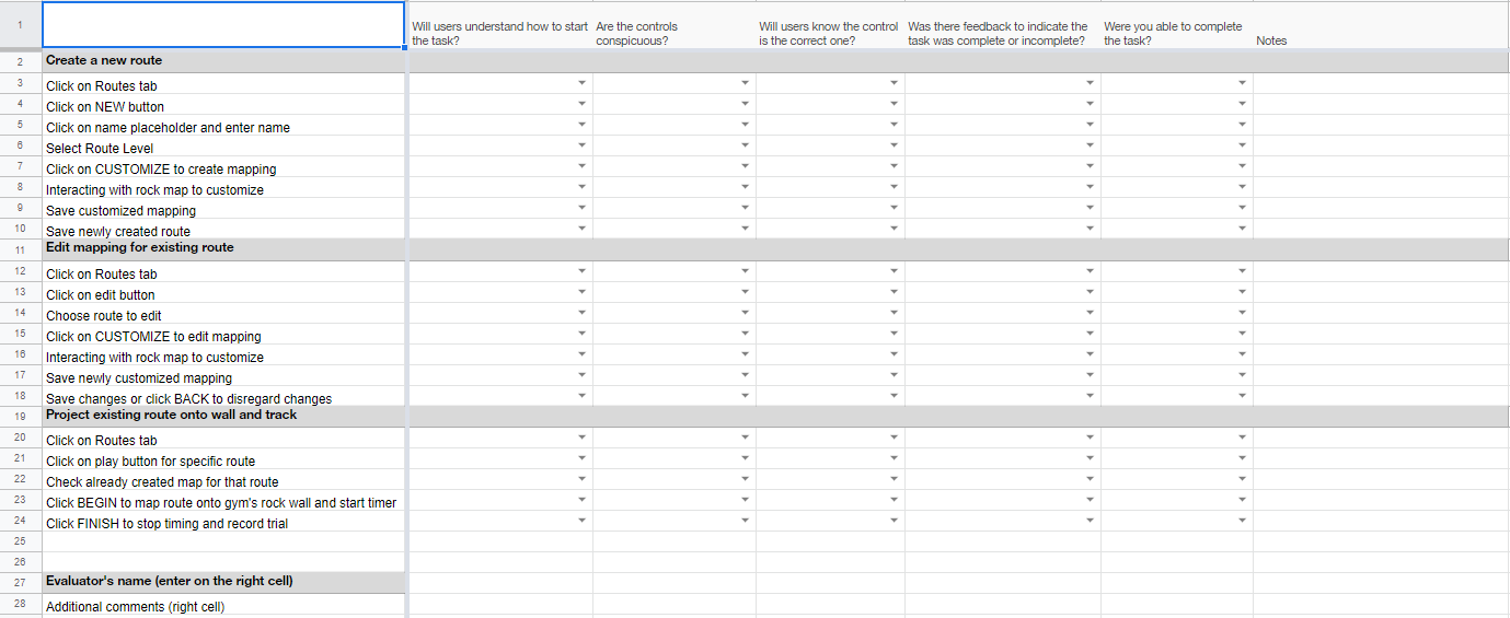
Results
We had four participants for our 2nd interactive prototype's cognitive walkthrough. Overall, the feedback received for the prototype was positive. Nevertheless, several problems seem to be persistent across different user-application interactions.
The first, being the most noticeable, is the discontinuity that disrupts the habituation in how users typically interact with everyday technology. Specifically, one particular function afforded by the prototype is the ability to allow users to name their personalized routes.
The problem comes from the lack of implementation available through Adobe XD. As a result, rather than displaying a typical keyboard by which the users can interact with, the prototype has a clickable placeholder that displays
an already determined name when clicked by the users. This bypass of a stereotypical typing interaction causes confusion for many of the testers, as evident by the evaluations obtained. This problem could be easily solved by
implementing a display of keyboard “pop-up” that would allow the users to connect the interaction with the name placeholder with the typical typing experience, thus negating the source of confusion.
Another problem associated with the current version of the prototype is the implementation of the “play” buttons next to the route name in order to allow users to access route information and wall-projection options. The problem comes from the lack of
association between the icon and the activity the button represents, causing some level of confusion for the users. To solve this, the application may allow the user to click directly onto the route’s name to access these functions
or implement a more “appropriate” icon (e.g. a “mountain” icon). With the next iteration of the prototype fixing these issues brought up by the users, the application should provide a much more seamless experience in promoting the
original idea of allowing users to create and project personalized routes.
Our group had a lot of fun going through the entire design thinking process the whole semester. You can view our shown prototype at this
link
and our final writeup at this
link.
Both are available at the top of this page as well!